Friday, 12 February 2016

Development of my front cover

Draft 1


Draft 2


My final front cover, contents page and double page spread


This is my final front cover for my magazine. To make this front cover I have payed attention to the feedback that I got from the market research. By doing this I could make sure that the front cover I create will suit my target audience and will be what the audience want. Overall I have made sure that it suits my target audience of young women, and I have done that by using the colour pink as this is a colour associated with girls. Also with the front cover the main image is non-sexual and girls would relate to this picture more as they may want to copy the costume and make up used. Also on my front cover I have made sure that everything relates to my Genre R&B, for example the artists I have used like Chris Brown and Trey Songz.

This is my final contents page for my magazine. On this media product I have decided to conform to common conventions with most of the aspects of the contents page. I have done this by keeping an organised page with use of columns, using a contents page masthead to allow the reader to know what page this is, using images to attract the reader to different articles etc. The reason why I have done this is because if a contents page is not done properly it can become confusing and messy, but the whole point of the contents page is so that the reader can find page numbers and certain articles, if the page is not organised the reader will not be able to do this. As well as this I have decided to keep the house colours continuing from the front cover over to my contents page, this makes all the media products tie in with each other so you can tell they are related to each others.


This is my final double page spread. On this double page spread again I have decided to carry on with the house colours to make sure that this product relates to my target audience of young girls. As well as the image I have used on the front cover, I decided to use a photo which gave off the same kind of impression off of my model. As well as this I have made sure that there is an equal balance between text and an image, this also relates to my audience by the fact that they are younger and wont want to sit down all day reading pages and pages of writing.

Thursday, 4 February 2016

Leading and Kerning

Kerning 

Kerning is the adjustment of the space in between characters in a line of text. The reason why we use kerning is because firstly it can make the characters more clear, for example, certain letter combinations such as WA, and VA can look cramped and over lacking if too close. So by using kerning and creating a larger space between characters can make the words look more clear and easier to read. Another reason why we use kerning is too make text stand out more on a page. For example by creating a larger gap between characters on a masthead, it will make it look bolder and also will take up more room on a magazine cover.  Kerning is important on a magazine cover as all text should always stand out and be eye catching to the audience.

Leading

Leading determines the amount of space between lines in a paragraph, and this is not affected by the length of ascenders and descenders. Looser leading allows the text to be more spread out across a page and makes it easier for the audience to read. Again the importance of this on a magazine is to make the text as clear as possible and also stand out so that the audience are attracted by it and can read the text as clearly as possible.


Thursday, 21 January 2016

Selected Photos


This is the first photo that I have picked from my photoshoot. In this photo I have used a high angle shot, with the model Imaani, looking straight at the camera. Having the model look straight at the camera is a good technique to entice an audience in. Also the photo may not have been as eye catching if she was not looking straight into the camera. Another reason why I chosen this photo is because she is sitting on a chair, rather than standing up which is more of a common pose. The reason why is because it gives the photo an edgy look and also makes the model look confident, which suits my genre R&B as the artists are usually quite confident and cocky. 


This is the second photo that I have chosen from my photo shoot. With this mid shot photo I have used a black background rather than white, as this will make the model stand out and instantly this will be what the audience will look at. Also in this photo I like the pose that Imaani is doing, a side on pose whilst still looking straight into the camera. The reason I like this pose is because its similar to some of the models and poses on popular music magazines such as billboard.


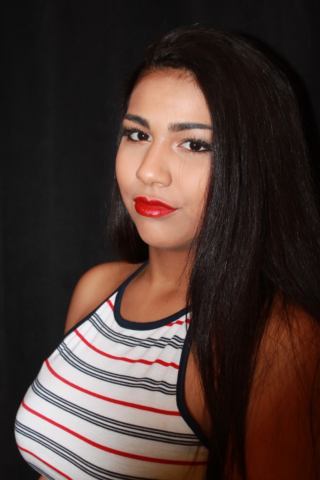
This is another photo which I have chosen from the photo shoot. One of the reasons why I have chosen this medium close up photo of Imaani is because of the lighting used, as this is a key feature making the photo really stand out in front of the black background. The use of lighting here will allow the audience to see the clear facial features of the model, and as well as this the lighting and the type of shot used draws us to look directly to the face. This is seen as a good aspect of the photo as my target audience are female, and the female audience will be interested by what the model looks like, what make up the model has on etc. 


This is the forth photo which I have chosen from my photo shoot, which is quite similar to the first photo I chose. One reason why I chose this photo is because of the white background used. The white background allows us too see everything clearly, and the lighting enhances this. I believe that having a light picture allows the audience too see every detail within the photo, giving them more to look at rather than a dark, shady picture which will not attract the audience.


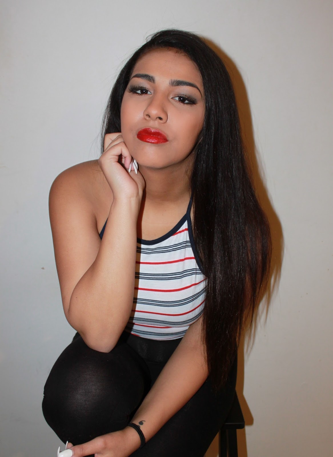
This is another photo which I chosen from the photo shoot. This medium long shot photo allows us to see more of the model, so the audience can now see the costume in more detail, and as the audience are females, this can attract them as people copy and follow what celebrities are wearing. Another thing about this photo is that even though the pose could be seen as more sexual than the others, this can still work to suit the genre and audience as it makes the model look more interesting and confident like the artists in the R&B genre.


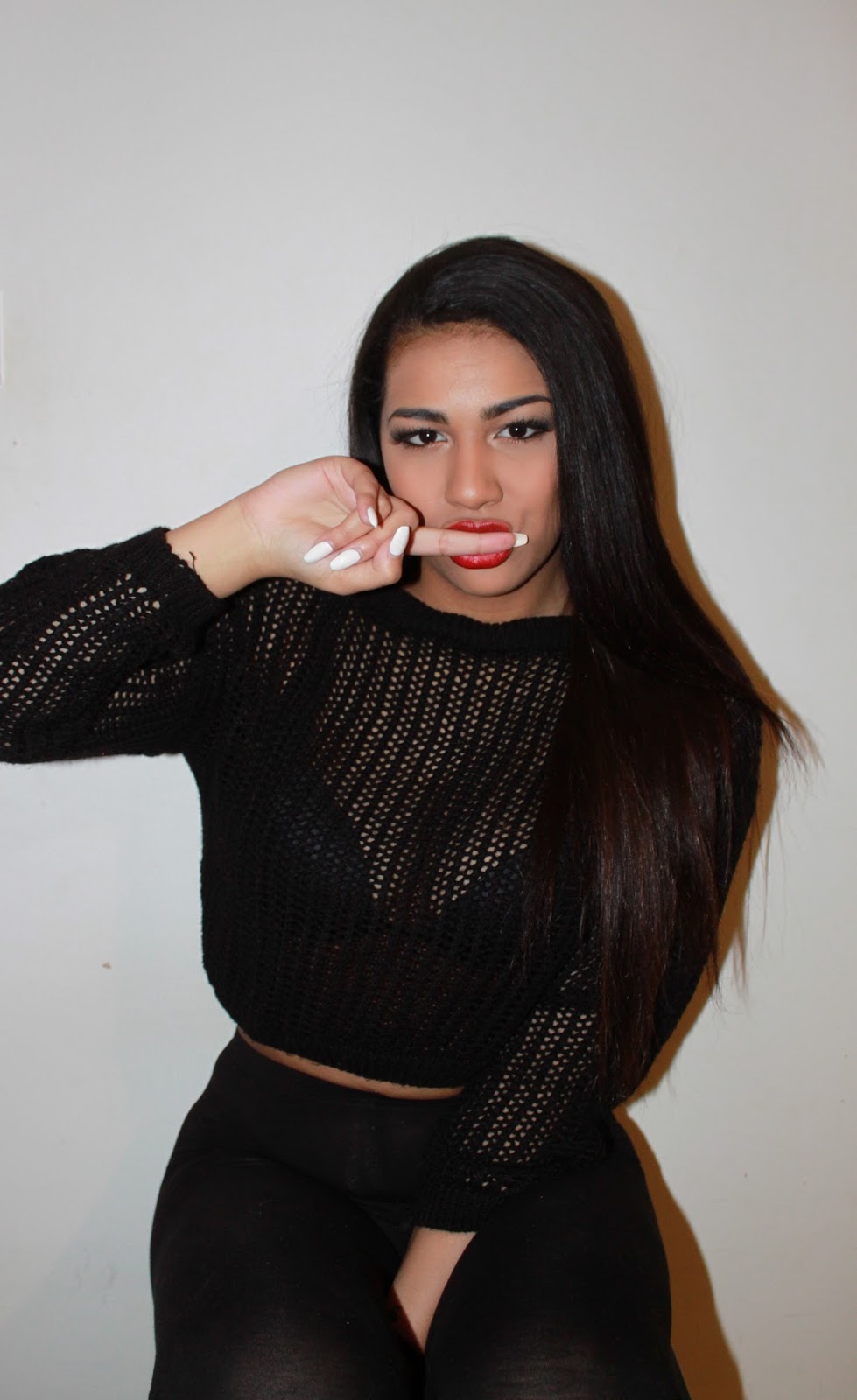
This is the sixth photo chosen from my photo shoot. Using this mid shot photo allows the audience to see more of the model, so the photo is focused both on the costume and the face. The costume/pose, with the hands in pockets in this photo suits my genre as again it is showing confidence and cockiness, and as well as this the serious face reinforces this. I like this photo as it is a bit different to a normal close up photo of a models face.

Overall I have chosen these photos as my favourites from the photo shoot because they all have good qualities of what I want on my magazine front cover. The different aspects of the photos that I like include the different poses in each photo, the change with both black and white backgrounds, the different costumes used in each photo etc. Also, the reason why I chose these photos is because I believed that they suit my target audience of young females.

Thursday, 14 January 2016

Photo Plan


This is a plan for some of the photos that I am planning to take for my photo shoot. I have decided to consider where the photo will be going on my magazine, when the photos will be taken, the poses, the location, the camera angle, the mise-en-scene within the picture and finally the background that I want on that photo. Considering all of these aspects for the photos I will be taking will make the photo shoot more organised and planned. Also if all aspects are of the photo are planned, they may be more professional and look more realistic.

Wednesday, 13 January 2016

Make up ideas


Here are some ideas for what lipstick colours I want my model to wear. The reason why I have gone with a red shade is because I am planning to have a red masthead and a red theme throughout my magazine, so if my model was wearing a red lipstick this would suit the magazine more than if my model was wearing a bright pink lipstick. Also I believe that red is an attractive colour and will be quite eye catching, meaning that it would draw in the audience. As my audience are females, having bold make up on my model can also be seen as eye catching to the audience as they like copying their favourite celebrity make up ideas, and outfits etc. The colour that I would think about using most is the first colour as it stands out and is eye catching as it is quite a bright colour, also it would make the models face stand out, but the dark colour wouldn't have the same effect. 


Here are some more lipstick ideas that I could use for my models make up. I have chosen these colours as they are more nude and natural than the red colours. Even though I am planning on having a red masthead, having my model wear more natural make up would be good for my target audience. As my target audience are girls, having someone with not a lot of make up is promoting the idea that women don't have to wear a lot of make up to look good. The colours that I would think of using would either be 1 or 9 as these colours look very natural but still have a bit of colour in them.


For the eyeshadow I would want my model to have a similar look to this. As I want my makeup to be quite plain, this would suit it as it does not look to sharp and not too many dark colours are used. Also these colours will highlight the eyes and make them stand out against the plain make up. Having plain nude make up promotes the natural look and encourages my target audience of young females to copy this natural make up.

Tuesday, 12 January 2016

Survey Monkey Results


I recently did a survey to my target audience of 15-25 year old's to ask which price would be suitable for my music magazine so that my audience would not find it too expensive. The results I have come out with are that 75% of people who answered said that £2.99 is the right price for me to use for my magazine, but 25% said £1.99. From these resulted I have decided to price my magazine at £2.99 as it best suits my target audience.