Saturday 26 September 2015

Masthead Designs


1) The first Masthead design is the actual School logo which will go along the top of newspapers and letters etc. The reason I have used this design for a possible Masthead on my magazine is because it is recognisable and everyone already knows this sign, which would work well on the magazine because everyone will know what it is for, and usually the more people that recognise this, the more people will take an interest. Also, this design uses the school tagline 'Be the best that you can be', which i thought would be a good feature to use within the masthead.

2) The second design is 'Plantsbrook' in large bubble writing. The reason I have chose bubble writing is because it is large and bold and can attract people into reading the magazine. Also I have used a bright red colour, this is firstly because red is a bold colour, which is another factor which will attract people in. But I have also used red because it is one of Plantsbrook's main colours, which means the masthead will link in with everything else.

3) The third Masthead is similar to the second masthead. The fact that it is in bubble writing, and with the bright red colour, both to entice people into reading the magazine. However on this Masthead I added in the black with the red, this is because these are the Plantsbrook colours and will once again link in with everything else. 

Tuesday 22 September 2015

School Magazine Mastheads


All of these school magazine masthead's are quite plain. They don't use many bright colours and have used a plain blue in each. The only masthead which shows a bit more difference and design is the first masthead as it has used a more interesting font than the other two which have stuck to plain fonts. Also on each of the masthead's they have used no images, and the only other part they have added to their mastheads are straplines. Overall, all of the masthead's are very plain and are not very interesting and eye catching.

School Magazine Analysis

This is my school magazine analysis. The analysis is divided up to show the denotations, connotations, media language and key concepts.

Magazine Analysis


This is my magazine analysis for this music magazine cover. Within this analysis I have analysed the 'Vibe' masthead, cover lines, anchorage text etc. I have tried to stick to using denotations, connotations, media language and key concepts.

Thursday 17 September 2015


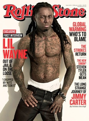
  • On all the magazine covers that I have found, the masthead is usually large and at the top of the cover. On each magazine the masthead is the largest piece of text and this can be used to attract the reader to it. Also with the bright colours such as the red used on the Vibe and Rolling Stone magazines, this also can be a way to attract attention because it stands on the cover. These magazine covers also show that the masthead colour always stands out in comparison to the background colour, another way of attracting readers. Aswell, on all of the magazine covers I chose, it shows that the main image covers the masthead. This could be showing that the magazine name is already established and viewers automatically know what magazine type it is.


  • Another common feature shown on all the magazines is that the main image is always placed in the centre of the cover. As this main image will be the first thing that the audience will view, it straight away tells them that this is who the main article will be on in the magazine. In addition to this, the main image of the artists shows that they are all looking directly into the camera, this could be suggesting that they want to entice us to read the magazine and the article about them.


  • On almost all of the magazines the writing is in a bold font which makes the overall look solid. Also the writing on magazine covers is usually in a simple font, which allows everyone to be able to read the writing. Having a simple writing allows people to read from a far, which will attract people to come read the magazine. The text colours usually follow a colour scheme throughout the front cover, making the magazine look professional and also to make it look good. The easiest colour to use for a background is usually white as it makes the rest of the page stand out. However, on some of these magazine colours, especially on the Katy Perry cover, it shows that other colours can work too, to make the rest of the page stand out.


Website Reviews

A lot of the websites that I looked at required me to sign up before I was able to view them, which made it hard when trying to review them. However, from not logging into the websites I thought that the PodOmatic, Wevideo and Flickr all offered a lot of information to what the website is about and the basic ways of how you would use it. Not only this but the websites looked professional and safe to sign up to. 

However, some of the websites which I might not have signed up for or used when first visiting their websites were Tubechop, Screencast and 4shared. These websites did not offer a lot of information, which didn't make me want to sign up. Also the layouts of the websites did not look professional.