Thursday 21 April 2016

Final product improvements


When it came to finishing my products I felt like there were extra improvements that needed to be made in order to make my magazine the best it can be. The improvements which I added to my final front cover were:

  • I made the main image sit in front of the masthead. The reason I did this was because it now follows common conventions of actual music magazine covers, as well as R&B magazines. By having my product conform to common conventions this makes it seem more professional and make it look like it is a well known magazine. Also by doing this, it pulls more attention towards my main image which is the most important aspect of the page.
  • Another improvement that I made to my final front cover was the pug used. The reason I changed it was because it now draws more attentions to the most important words such as 'Beyonce', where as before there was nothing standing out which would attract the reader. Also by adding the word 'Crazy' just makes it seem more interesting and something fun which the audience will be attracted to.


 As well as my front cover, I have made improvements to my final double page spread in order to make it to the highest standard and so it has more affect on the audience/reader. The improvements that I have made are:


  • I have added a third pull quote onto the top left of the right page. The reason I have done this is because it then balances out the text across the whole double page spread, making it so there is something to look at in each section of the page, as before it was just plain in the top left corner. As well as this it is another aspect which will pull in the reader.
  • Another improvement is that I have extended the 3rd column and added a final question. The reason why is before there was a large gap at the end of the article, so to even it out I thought that extending the page would make it look more attractive.

I have not made any improvements to my contents page as I feel that there was nothing more to add or to change which would make it any more attractive and appeal to the audience.

Tuesday 12 April 2016

Question 4: Who would be the audience for your media product?

Firstly my music magazine 'Impact' is aimed at mainly women aged 15-25. Even though this is a large age gap to fill I decided this because as my magazine is mainly aimed towards women rather than men, so to widen my audience I could extend the age range. From this age range I know that from around 15-21 most of my audience will still be in school, college, and university, meaning that none of these ages will have full time jobs with a stable cash flow. However, the majority of people at these ages may have a part time job in retail, restaurants, supermarkets, small shops etc. These jobs are usually on a 0 hour contract so their income, whether they are paid each month or each weak, changes depending on how many hours they have worked. As well as this these jobs aren't stable and you are able to leave or be fired at any point. This shows that the younger part of my audience may not have lots of money for spending on extra things like magazines when they only have part time jobs, or may even still just be in school, and for this reason I have made my magazine £2.99 as this is still affordable for someone who doesn't have a lot of spare money. For the other part of my audience around 22-25, these women are still young but may be at a different point in their life. They may have left university and now have found a stable job, and this job could be anything like a teacher, nurse, in fashion etc. however the type of person I believe to be my audience will still be sociable, fun and outgoing.

My audience of 15-21 will most likely either still be living at home, or university accommodation or sharing a house at uni. All these places suggest that they will not have huge houses for themselves but will have a small amount of space of their own like there bedroom. For the people still living at home or in a sharing house they may have customised their room to make it to their taste, it may be quite organised and stylish as I believe my audience will take pride in things that they own, and as my audience are girls it is more likely that they will be organised, tidy and stylish as stereotypically men aren't the organised, stylish type. However, for my audience that live in student accommodation, they may not have the room to style out there living space as usually student accommodation isn't the largest of places, but they may still keep an organised room. For my audience past university or at that age, they may move back home which is a common thing to do due to student loans and they may not be able to afford a house/flat. However, some people at this age may have small house/flat as a starting point for their life.

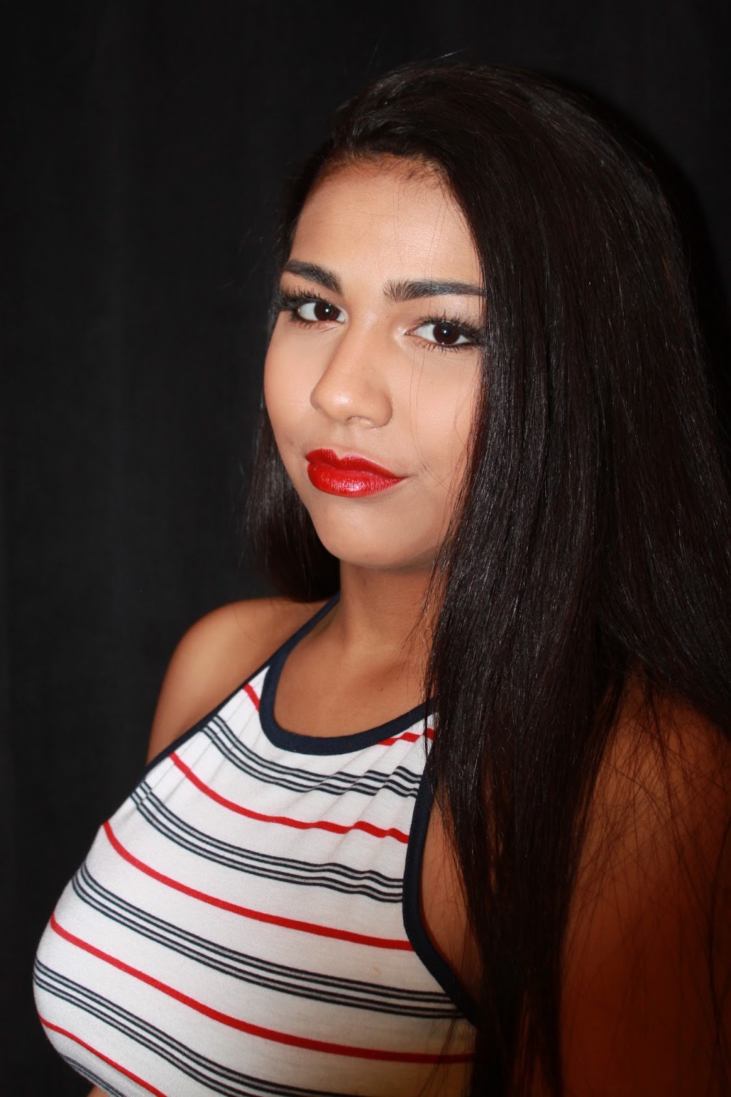
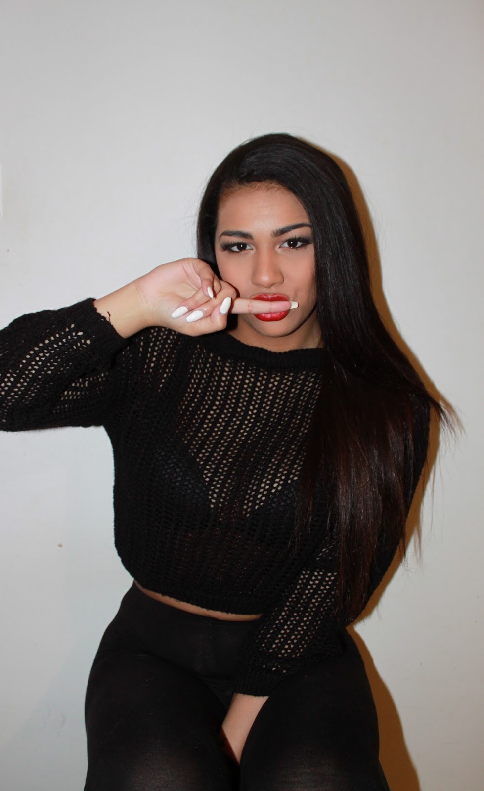
My audience would most likely be quite fashionable, as young girls usually take a lot of care of themselves and enjoy looking good. As they are still in school/universities/part time jobs etc. they probably won't be able to afford high end fashion so would most likely shop at places like Topshop, H&M, New Look, Urban Outfitters, River Island etc. However, depending on how much money people have or for special occasions, my audience may buy the occasional high end fashion product, such as a dress, sunglasses, shoes etc. Another part of my audience that will be a large part of their life will be music, particularly R&B. If my audience are at home listening to music then they may use their computer/laptop, which includes all types of ways that they are able to listen to music such as youtube, apple music, iTunes, spotify, sound cloud. When my audience are out they would probably listen to their music the same way but using their phone and headphones, but they will be more likely to use the other ways rather than youtube as this requires you to have access to the internet and keep the app open whilst using it, which isn't the easiest way to listen to music whilst out.

I believe that as my audience are still young, they will still have lots of time for socialising and going out. As my audience are both women and young, I believe they may be interested in going to the cinema, going out for meals, going shopping, going round to friends houses, clubbing etc. They will want to enjoy their social life and enjoy their life whilst they are still young and don't have big responsibilities to worry about. Whilst they are enjoying their youth, they are most likely to spend money on things like social outings, fashion and make up (considering my audience are girls, they will probably spend quite a bit of there money on this) etc. If they are at university they may need to pay for loans, accommodation, food as well as all the other things they would buy.

On the JICNAR my audience are most likely to be either group E which are "unskilled" casual workers, depending on state benefits or students or group D that are "partly skilled" semi or unskilled
manual workers.

JICNAR Scale

Group A (Professionals)
Upper middle class e.g. Barrister, Doctors, Executives

Group B (Managerial)
Middle class e.g. Bank managers, Teachers

Group C1 (Non-Manual)
Lower middle class, white collar workers e.g. Office workers

Group C2 (Manual)
Skilled working class, blue collar workers e.g. Car mechanic, Machine operators, Construction workers

Group D (Partly Skilled)
Semi or unskilled manual workers e.g. Assembly line worker

Group E
Casual workers, dependent on state benefits, students

Question 3: What kind of media institution might distribute your media product and why?


Question 2: How does your media product represent particular social groups?


https://prezi.com/189whiwg3b4v/how-does-your-media-product-represent-particular-social-grou/#

Wednesday 2 March 2016

Double Page Spread Interview

At a young age of just 17, Marni has become one of the most recognisable names across the world in 2016. Starting from her home town Birmingham, she has started from the bottom and now she's at the top with her first number 1 single! After being recognised for her outstanding vocals on her YouTube videos, Marni has now caught the attention of the world and IMPACT have called her in to interview her on her new found success.

Marni, you really have rose to the top in such a short amount of time, how are you reacting to the new fame and attention?

“Honestly, it has been a whirl wind. Coming from being completely unknown and being a young girl from Birmingham, to then having a number 1 single has been amazing. I would never have expected this. I am just so grateful and I thank everyone so much for getting me to this point.”

Considering you are still so young, when did you know that music was a passion of yours?

“I have always enjoyed singing, music, dancing and from as young as I can remember I was always interested. From putting on performances for my family and singing into my hairbrush, to even just school productions I think it was clear to me that I wanted this to always be involved in my life.”

Who was your inspiration in the music industry?

“I must admit; I have always been a huge Beyoncé fan. I have grown up listening to her music, from Crazy in Love to Single Ladies I have always been obsessed. So I would say that Beyoncé is definitely one of my biggest inspirations in the music industry, along with other major artists like Drake, Chris Brown, Alicia Keys and so many more.”

What were you doing before your recent success?

“I was just a normal teenager. I was at my school doing my A-levels, I had nothing planned in the near future for music, but just to finish school and maybe go to university.

How would you describe your style of music?

“I would describe my music as old R&B, similar to the R&B music around the year 2000. However, I wouldn’t like to limit myself to just one style of music, I am only 17 and I would like to think that over my music career I will create many different songs and albums of different styles.”

As you were recognised from your YouTube channel, when did you first consider making a YouTube account for your music?

“Around a couple of years ago I made my first YouTube account. At the time I never really thought about uploading videos of me singing, it was more for fun, just uploading videos of me and my friends. After having my YouTube account for a while, and seeing many singing videos, I was inspired to make my own. I only expected a couple of views, I never expected anything to come from it.”

What are you planning to do in your future, does it involve music?

“Absolutely, this is only the start for me. I am so happy to have even got this far in the music industry, but I will always keep trying and keep going. I can’t see myself doing anything else apart from singing.”

What would you say to young people like yourself who haven’t yet made it to the music industry?

“Always keep believing in yourself, you never know what could happen next so keep going and don’t give up."

Thank you so much Marni for coming to IMPACT today, but the final question that everyone is dying to know the answer to is, what’s next?


“I have a few things planned for the near future. I am planning on creating my first album, after my first single being a success I have a lot to live up to so I will be working extremely hard to make my first album one to remember. Apart from this I have a few appearances and performances, but you will definitely be hearing me again.”

Wednesday 24 February 2016

Contents Page Research

The research that I have done on previous content pages shows the common conventions:

  • One common convention is the use of imagery on every contents page. Some contents pages keep it simple with one large image, usually of a popular well known artist, or other contents pages have many images around 4/5. However even on the pages with more than one image, there is always 1 larger than the rest, this shows the importance of this image and artist in comparison to the others.
  • Another common convention is the contents heading. On almost every single example that I found they have a large 'contents' at the top of the page. This is clearly stating to the reader that this is the contents page. This is one of the main common conventions that appears on basically all music magazine contents pages.
  • One other common convention is page numbers, next to both text and images. This allows the reader to locate a certain part of the magazine related to what is shown on the contents page (either the images or text). This is seen on every contents page otherwise the contents page would be pointless, this shows the importance of page numbers.
  • Another common convention of this is the column structure of the text. Again, like the images, contents heading and page numbers, the column structure is found on each contents page. This makes it easier for the reader to read and also locate specific things which they want to read about. Also the contents page is one of the most structured in the magazine, so by adding columned text adds to the structure.
  •  Another common convention is captions/anchorage text. This is used so that the reader knows more about the image and has context to go off. If an image was there with no anchorage text the reader wouldn't know what the image is about.
  • One more common convention is that the contents pages follow a colour scheme, and this is most likely followed throughout the magazine. For example the bottom left image has a red and white theme throughout. This makes the magazine look more attractive and consistent.

Friday 12 February 2016

Development of my front cover

Draft 1


Draft 2


My final front cover, contents page and double page spread


This is my final front cover for my magazine. To make this front cover I have payed attention to the feedback that I got from the market research. By doing this I could make sure that the front cover I create will suit my target audience and will be what the audience want. Overall I have made sure that it suits my target audience of young women, and I have done that by using the colour pink as this is a colour associated with girls. Also with the front cover the main image is non-sexual and girls would relate to this picture more as they may want to copy the costume and make up used. Also on my front cover I have made sure that everything relates to my Genre R&B, for example the artists I have used like Chris Brown and Trey Songz.

This is my final contents page for my magazine. On this media product I have decided to conform to common conventions with most of the aspects of the contents page. I have done this by keeping an organised page with use of columns, using a contents page masthead to allow the reader to know what page this is, using images to attract the reader to different articles etc. The reason why I have done this is because if a contents page is not done properly it can become confusing and messy, but the whole point of the contents page is so that the reader can find page numbers and certain articles, if the page is not organised the reader will not be able to do this. As well as this I have decided to keep the house colours continuing from the front cover over to my contents page, this makes all the media products tie in with each other so you can tell they are related to each others.


This is my final double page spread. On this double page spread again I have decided to carry on with the house colours to make sure that this product relates to my target audience of young girls. As well as the image I have used on the front cover, I decided to use a photo which gave off the same kind of impression off of my model. As well as this I have made sure that there is an equal balance between text and an image, this also relates to my audience by the fact that they are younger and wont want to sit down all day reading pages and pages of writing.

Thursday 4 February 2016

Leading and Kerning

Kerning 

Kerning is the adjustment of the space in between characters in a line of text. The reason why we use kerning is because firstly it can make the characters more clear, for example, certain letter combinations such as WA, and VA can look cramped and over lacking if too close. So by using kerning and creating a larger space between characters can make the words look more clear and easier to read. Another reason why we use kerning is too make text stand out more on a page. For example by creating a larger gap between characters on a masthead, it will make it look bolder and also will take up more room on a magazine cover.  Kerning is important on a magazine cover as all text should always stand out and be eye catching to the audience.

Leading

Leading determines the amount of space between lines in a paragraph, and this is not affected by the length of ascenders and descenders. Looser leading allows the text to be more spread out across a page and makes it easier for the audience to read. Again the importance of this on a magazine is to make the text as clear as possible and also stand out so that the audience are attracted by it and can read the text as clearly as possible.


Thursday 21 January 2016

Selected Photos


This is the first photo that I have picked from my photoshoot. In this photo I have used a high angle shot, with the model Imaani, looking straight at the camera. Having the model look straight at the camera is a good technique to entice an audience in. Also the photo may not have been as eye catching if she was not looking straight into the camera. Another reason why I chosen this photo is because she is sitting on a chair, rather than standing up which is more of a common pose. The reason why is because it gives the photo an edgy look and also makes the model look confident, which suits my genre R&B as the artists are usually quite confident and cocky. 


This is the second photo that I have chosen from my photo shoot. With this mid shot photo I have used a black background rather than white, as this will make the model stand out and instantly this will be what the audience will look at. Also in this photo I like the pose that Imaani is doing, a side on pose whilst still looking straight into the camera. The reason I like this pose is because its similar to some of the models and poses on popular music magazines such as billboard.


This is another photo which I have chosen from the photo shoot. One of the reasons why I have chosen this medium close up photo of Imaani is because of the lighting used, as this is a key feature making the photo really stand out in front of the black background. The use of lighting here will allow the audience to see the clear facial features of the model, and as well as this the lighting and the type of shot used draws us to look directly to the face. This is seen as a good aspect of the photo as my target audience are female, and the female audience will be interested by what the model looks like, what make up the model has on etc. 


This is the forth photo which I have chosen from my photo shoot, which is quite similar to the first photo I chose. One reason why I chose this photo is because of the white background used. The white background allows us too see everything clearly, and the lighting enhances this. I believe that having a light picture allows the audience too see every detail within the photo, giving them more to look at rather than a dark, shady picture which will not attract the audience.


This is another photo which I chosen from the photo shoot. This medium long shot photo allows us to see more of the model, so the audience can now see the costume in more detail, and as the audience are females, this can attract them as people copy and follow what celebrities are wearing. Another thing about this photo is that even though the pose could be seen as more sexual than the others, this can still work to suit the genre and audience as it makes the model look more interesting and confident like the artists in the R&B genre.


This is the sixth photo chosen from my photo shoot. Using this mid shot photo allows the audience to see more of the model, so the photo is focused both on the costume and the face. The costume/pose, with the hands in pockets in this photo suits my genre as again it is showing confidence and cockiness, and as well as this the serious face reinforces this. I like this photo as it is a bit different to a normal close up photo of a models face.

Overall I have chosen these photos as my favourites from the photo shoot because they all have good qualities of what I want on my magazine front cover. The different aspects of the photos that I like include the different poses in each photo, the change with both black and white backgrounds, the different costumes used in each photo etc. Also, the reason why I chose these photos is because I believed that they suit my target audience of young females.

Thursday 14 January 2016

Photo Plan


This is a plan for some of the photos that I am planning to take for my photo shoot. I have decided to consider where the photo will be going on my magazine, when the photos will be taken, the poses, the location, the camera angle, the mise-en-scene within the picture and finally the background that I want on that photo. Considering all of these aspects for the photos I will be taking will make the photo shoot more organised and planned. Also if all aspects are of the photo are planned, they may be more professional and look more realistic.

Wednesday 13 January 2016

Make up ideas


Here are some ideas for what lipstick colours I want my model to wear. The reason why I have gone with a red shade is because I am planning to have a red masthead and a red theme throughout my magazine, so if my model was wearing a red lipstick this would suit the magazine more than if my model was wearing a bright pink lipstick. Also I believe that red is an attractive colour and will be quite eye catching, meaning that it would draw in the audience. As my audience are females, having bold make up on my model can also be seen as eye catching to the audience as they like copying their favourite celebrity make up ideas, and outfits etc. The colour that I would think about using most is the first colour as it stands out and is eye catching as it is quite a bright colour, also it would make the models face stand out, but the dark colour wouldn't have the same effect. 


Here are some more lipstick ideas that I could use for my models make up. I have chosen these colours as they are more nude and natural than the red colours. Even though I am planning on having a red masthead, having my model wear more natural make up would be good for my target audience. As my target audience are girls, having someone with not a lot of make up is promoting the idea that women don't have to wear a lot of make up to look good. The colours that I would think of using would either be 1 or 9 as these colours look very natural but still have a bit of colour in them.


For the eyeshadow I would want my model to have a similar look to this. As I want my makeup to be quite plain, this would suit it as it does not look to sharp and not too many dark colours are used. Also these colours will highlight the eyes and make them stand out against the plain make up. Having plain nude make up promotes the natural look and encourages my target audience of young females to copy this natural make up.